
17 Jun REVIEW:15 YEARS OF TRENDS IN NAVIGATION STRUCTURES
You are a football supporter because of a combination of passion and affinity with your local club – regardless of the result, status or position on the rankings – whether or not nourished by a chronic form of mental disturbance. As a loyal FC Dordrecht supporter and Feyenoord sympathizer, I am well aware that my passion will evoke compassion more often than I would like. I get all the happier when I see on Teletext that our pride is at the top with 19 out of 7! I am still waiting for the day that the statue for Marco Boogers will be unveiled in the center of Dordrecht because he does it every year again with minimal means to put down a balanced selection that structurally turns at the top of the left row. They can learn something from that structural character in Rotterdam …
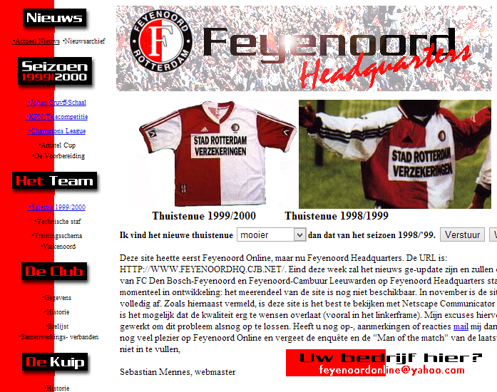
My very first website from 1999
The link between that entire football story and navigation structures of websites? Well, the very first website I made coincided – painfully enough – with the latest domestic success of the club from my hometown. Feyenoord Headquarters reported enthusiastically in 1999 on the adventures of Jean-Paul van Gastel and co. Not a bad team, that with names such as Julio Ricardo Cruz, Jon Dahl Tomasson, and Bonaventure Kalou would today also undoubtedly become champions of the Eredivisie. However, if I look at the website from then on with my critical eye from now on, I cannot suppress a smile. A lot has changed in the last 15 years.
& nbsp;
& nbsp;
& nbsp;
& nbsp;
& nbsp;
& nbsp;
& nbsp;
& nbsp;
& nbsp;
& nbsp;
& nbsp;
& nbsp;
& nbsp;
& nbsp;
Horizontal vs. Vertical
From my prehistoric creation, it is immediately noticeable that the main navigation consists of a list that is positioned on the left side of the website. This concept was quickly abandoned at the turn of the millennium after research into navigation structures showed that most visitors view a website in the form of an “F”. If the entire trunk of the F then concerns the main navigation, that is, of course, a waste of space. Soon, therefore, most web designers chose to use the head of the F for a horizontal menu structure; a proven recipe that even today guides the majority of surfing website visitors through the content. Nowadays, the left-hand tribe is often used for sub-navigation, filtering and/or advertising purposes.
Do not see the forest for the trees anymore
With a horizontal menu structure, submenus are usually unavoidable. A little website simply has more content and components that can be displayed in the width. The average internet user is therefore conditioned to expand submenus that appear in all sorts of shapes and sizes under the main navigation. At a certain point, those tree structures started to get out of hand, when entire laundry lists of sub-sub-sub and sub-menus did not make things more user-friendly or clear. People could no longer see the forest for the trees.
Appley
For web design, it is often the case that when the greats make a certain choice, the after-mass of the masses quickly follows. This also applied to the “less is more” style that Apple implemented in its online designs. The simple, sleek and gray navigation bar with round corners and glow effect still adorns the website – although it can be expected that with the arrival of iOS 7 the web design of the Apple site itself will be thoroughly addressed.
In any case, it is high time for Tim Cook and his followers to structurally silence critics with new innovations, now that the Dutch language today is even polluted by the word “appley,” which is a hipster designation of something that is old-fashioned. Quite discharged considering the – still – magisterial products, but unmistakably a sign on the wall … Whatever the case may be; many web designers were inspired by Apple’s tight menu structure, after which many websites could be clicked to subpages in the same way. According to web design trend watchers, that is no longer possible today. Steve Jobs is sorely missed, at least that much is clear.
Mega
From less is more it is a fairly big step n